In what ways does your magazine product use, develop or challenge forms and convection of real media products?
Magazines typically follow conventions in order to ensure a successful magazine; these conventions consist of a masthead, a dominant and sticking cover image and an attractive colour scheme that consist of no more than 3 colours; all of which create the format of the magazine. Additionally, typical magazines include a memorable sell line, which is the function of the magazine, and cover lines, which construct the formula.
I chose to follow the main conventions throughout my magazine in order to attract my audience as the conventions would create familiarity.
Masthead
The masthead of a magazine is located in the top few inches of the cover; this allows it to be easily seen when on a crowded news-stand. I chose to use a bold black masthead as this would allow the masthead to remain identical throughout every issue therefore making my magazine easily recognisable to readers (see figure 1).
 |
| Figure 1 - Resonance Masthead |
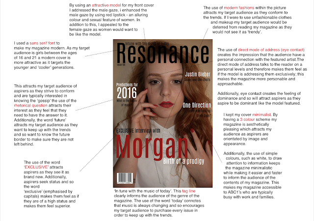
I chose to use a sans serif front for my masthead as this made the title bolder, additionally sans serif fonts create a modern feel that was necessary for my magazine genre as I focused on following modern trends. By choosing a black, sans serif masthead I created a bold and recognizable brand for my magazine that would attract my target audience of 16 to 21 year olds.
At first my masthead was very different. Originally, the name of my magazine was ‘Fix’, however I changed this to ‘Resonance’ (meaning “a quality of richness or variety” and “the quality of a sound that stays loud, clear, and deep for a long time”; therefore, portraying the genre of my magazine) as when asking my target audience, I found that they felt that the word ‘Fix’ connoted drugs and therefore appeared to suggest an indie genre. Additionally, the word ‘Fix’ did not fill the cover (see figure 2) and so I chose a longer word that was more aesthetically pleasing.
 |
| Figure 2 - Original Masthead |
Cover Image
 |
| Figure 3 - Original Cover Image |
The cover image is an important feature of the magazine as it is the first thing that the audience sees, therefore it gives the first indication of the format of the magazine. Consequently, the image must be striking and attractive to the audience to grasp their attention in a short space of time.
 |
| Figure 4 - Edited Cover Image |
A typically convention of music magazines is to use eye contact on the cover image, I chose to stick with this convention. Eye contact from the featured artist evokes an attachment with the audience, as a result the audience are more likely to purchase the magazine. In addition, it was important for me to include an image that had eye contact (see figure 3) because my issue focused on one artist with the main feature article being an interview. Because of this my image is successful as it connotes a feeling of vulnerability and truthfulness that the audience would expect from the interview.
In order to make my magazine image striking I used the colour red on the models lips and nails. The colour red is a bright colour and so would attract attention, additionally, red connotes love and allure and so signifies to my audience that this artist is love and popular within the music industry. When editing my image, I chose to enhance the colour red (see figure 4) to create an interesting and striking image.
Colour Scheme
 |
| Figure 5 - an example of a '3' colour scheme used in a music magazine. |
 |
| Figure 6 - Final Contents Page |
Because of the use of red in my cover image I chose to use red throughout my colour scheme, by using the same colour as seen on the model I created continuity and allowed me to establish my houses style clearly for the audience. A convention of magazines is to use 3 colours as to not over crowed the page (an example of this is seen in figure 5). Because my target audience of aspirers wanted a minimalistic cover (due to their orientation around the attractive appearance of products) chose to include this convention in my music magazine therefore, I only used red, black and white on my cover and throughout my magazine. Because the colour red was the boldest colour, I used it to draw the readers’ attention to certain articles and information. For example, in my double page spread (figure 6) I chose to make the article title and the pull quite red in order to create a more interesting layout and draw attention to these two features.
Sell Line
A sell line, or selling line, is a short description of the main marketing point or philosophy of the magazine. The sell line gives the audience an indication into the function of the magazine and can be used to attract the reader. I chose the sell line “Intune with the music of today” as it indicted the purpose of my magazine, which is to feature the changing trends of music. By using “music of today” I ensured that my sell line could be used throughout every issue as it didn’t specify one genre; this was important for my magazine as it showed popular music of the time, therefore allowing the genre of my magazine to change along with popular culture.
Cover lines
 |
| Figure 7 - An example of cover lines used in a music magazine. |
The cover of a magazine features cover lines, inform the audience of the formula of the magazine.
 |
| Figure 8 - My magazine cover |
Typically, a music magazine has a lot of cover lines on the cover (see figure 7) as this allows them to inform the reader and therefore attract the reader’s attention resulting in the purchase of their magazine.
I chose not to include a lot of cover lines in my magazine as my target audience wanted a minimalist cover. Therefore, I chose to challenge conventions and have less cover lines. In order to make my cover attractive I chose to replace multiple cover lines with a large main cover line (seen in figure 8) which clearly indicated the main focus of the issue. I feel that by doing so I made my cover simple and effective in quickly informing my target audience of the contents of the magazine.
Conclusion
Overall, I feel that my magazine is successful. By following conventions, such as using a sell line and including a striking image, I have created a professional looking music magazine that will attract audiences in a effective way. By challenging conventions, much like RayGun does, I would be limiting myself to a niche audience and consequently making my magazine less successful as I aim target a mass audience. Therefore, by following conventions I have created a distinguishable magazine.
Due to the chart genre of my magazine my audience would be ABC1 aspirers. Aspirers like attractive products and like to follow the trends. They do not like to stand out and so my magazine will appeal to them as it allows them to keep up to date with the latest music.
My audience would be mainly female due to the gossip approach of my magazine - this approach will equally attract aspirers as they 'aspire' to be like the people they read about - however I attempted to make my magazine gender neutral as to not alienate a range of audiences.
Additionally, my audience will be young adults, primarily between the ages of 16 and 20. Typically, this age group is more interested in current music (NRS results show that 164,000 ABC1 between the ages of 15 and 34 purchased Q magazine; a magazine that features similar music to my own) and social ideas that will be featured in my magazine. As well as this, they are more likely to have a disposable income, due to their ABC1 status, that allows them to purchase my magazine.
Who would be the audience of you media product?
Unfortunately my evaluation video would not load. Below is the link.Due to the chart genre of my magazine my audience would be ABC1 aspirers. Aspirers like attractive products and like to follow the trends. They do not like to stand out and so my magazine will appeal to them as it allows them to keep up to date with the latest music.
My audience would be mainly female due to the gossip approach of my magazine - this approach will equally attract aspirers as they 'aspire' to be like the people they read about - however I attempted to make my magazine gender neutral as to not alienate a range of audiences.
Additionally, my audience will be young adults, primarily between the ages of 16 and 20. Typically, this age group is more interested in current music (NRS results show that 164,000 ABC1 between the ages of 15 and 34 purchased Q magazine; a magazine that features similar music to my own) and social ideas that will be featured in my magazine. As well as this, they are more likely to have a disposable income, due to their ABC1 status, that allows them to purchase my magazine.
How did you attract/address your audience?

How does your magazine represent a particular social group?
What Kind of Media Institution might Distribute your Media Product and Why?
Looking back at your preliminary task, what do you feel you have learnt in the progression from it to your full product?
For my preliminary (prelim) task I had to produce the front page of a new school magazine, featuring a photograph of a student in a mid shot with appropriate text and masthead. As well as this I had produce a contents page to go with the front cover.
I had originally planned to set my preliminary front cover in a science lab and have a student use the equipment, unfortunately, all of the science labs were unavailable; therefore, I chose to take my picture outside. I decided to feature a student doing school work as this was relevant to the purpose of my magazine. By taking the picture outside I made my magazine appear positively and therefore make the issue more appealing. (see figure 1)
Editing
 |
| Figure 1 - Original Prelim image |
 |
| Figure 2 - Edited Prelim image |
Due to the natural light and setting I chose to edit the image by enhancing the colour and removing any imperfections from the surroundings. (see figure 2). I also did this in my final task. For my music magazine I used artificial light (a skill that I had learnt throughout the process) therefore, the picture appeared more professional than my prelim task. Additionally, my final magazine image had imperfections that I removed in order to make the magazine more aesthetically pleasing (see figures 3 and 4). Similarly, I enhanced the colour of my final magazine, this was not to make the magazine appear in a more positive way but was to exaggerate the use of the colour red throughout my magazine. I feel that the editing for my music magazine is more natural than my preliminary task and therefore more successful.
 |
| Figure 3 - Original image |
 |
| Figure 4 - Edited image |
Image
My music magazine image is more successful than my prelim image for different reasons. Firstly, my preliminary image was landscape; this was unsuccessful as all magazines are portrait. However, my final magazine image was portrait therefore making it more conventional and more successful. By having a portrait image, I was able to position the cover lines more effectively in order to make the magazine look and feel professional.
Furthermore, my prelim image did not engage with the audience as the model was looking down, although this was to show her doing her work, it is ineffective in evoking emotional connections with the audience. Consequently, my music magazine image is more effective as the model uses eye contact to engage with the audience and connote the personal aspect of the issue. Throughout the process I learnt about the importance of images and their positioning, therefore I knew that eye contact would be more effective in enticing my audience’s attention.
For my prelim task I used an iPod 5, this provided a reasonable picture quality, however, for my final product I used a Nikon 1 J2 camera. This improved my final image as it had a better pixel quality than the iPod 5 and provided me with more flexible options. For example, the Nikon had a 30 mm zoom, which allowed me to prevent my shadow being in the shot while still getting a close up shot. As well as this, the Nikon had a range of built in editing options such as Selective Colour and Backlighting which helped to enhance my image. Furthermore, the use of a tripod allowed me to get a stable image using the Nikon which could not have been achieved through the iPod. The iPod was good as it was easy to access and was quick in transferring the images, however, the Nikon provided a better quality and a wider range of photography techniques.
Photography
For my prelim task I used an iPod 5, this provided a reasonable picture quality, however, for my final product I used a Nikon 1 J2 camera. This improved my final image as it had a better pixel quality than the iPod 5 and provided me with more flexible options. For example, the Nikon had a 30 mm zoom, which allowed me to prevent my shadow being in the shot while still getting a close up shot. As well as this, the Nikon had a range of built in editing options such as Selective Colour and Backlighting which helped to enhance my image. Furthermore, the use of a tripod allowed me to get a stable image using the Nikon which could not have been achieved through the iPod. The iPod was good as it was easy to access and was quick in transferring the images, however, the Nikon provided a better quality and a wider range of photography techniques.
Conventions
 |
| Figure 5 - Final Preliminary Cover |
When constructing the prelim task I was unware of some magazine conventions, this resulted in a cover that had very little conventions featured. For example, ‘study break’ has no barcode, although this is not a feature exclusive to magazines, a barcode is essential in order to sell the magazine. Without a barcode ‘study break’ would not be able to be sold. As well as this, my preliminary task does not have a sell line. A sell line is a convention of a magazine that informs the audience of the purpose of the magazine; without a sell line ‘study break’ would be unsuccessful as it would not inform the audience of its function and therefore would be less likely to attract its target audience.
My music magazine contrast this as it includes these conventions. Between finalising my prelim task and composing my final piece, I researched into the conventions of a music magazine and found that a barcode in the left third of the magazine and a sell line within the masthead were both typical and important conventions of a music magazine. As a result, to make my magazine look professional, I chose to include these two conventions in my final magazine.
By including these conventions, my final piece was an improvement on my preliminary task as it accurately imitated successful music magazines and more effectively informed my target audience of the function of the magazine.
Contents page
 |
| Figure 6 - Final Prelim contents page |
From researching into magazine contents pages my final product has developed dramatically from my preliminary task. My prelim contents page was unsuccessful and did not follow the appropriate conventions (see figure 5). By positioning the title ‘contents’ at the bottom of the page my prelim does not clearly indicate the function of the page; this would make it difficult for busy people to understand the purpose of the page and therefore deter them from reading the magazine.
Furthermore, there is very little colour used on the contents page to attract the reader’s attention to specific information. This consequently makes the contents page seem boring and unappealing.
 |
| Figure 7 - Final Music magazine contents page |
Finally, the prelim contents page does not include other images, which is a convention of magazines. This also makes the page boring and unappealing resulting in the magazine being unsuccessful.
I learnt from these mistakes when making my final piece and so included colour and images in my contents page (see figure 6). By including colour I was able to draw attention to different information, I enhanced this effect by also using different sizes in order to make the page more interesting.
As well as this, my final contents page included smaller images to further inform the audience of other artist and therefore appeal to a wider range of people and tastes. By applying this convention to my final piece I created a more successful contents page than that of my preliminary task and therefore improved in the progression from my prelim task to my final piece.
Conclusion
Due to further research and planning following my prelim task I learnt about the features needed to make a successful magazine. Because of this I was able to produce a better piece that included successful aspects and conventions, therefore producing a more professional and appealing final piece.
No comments:
Post a Comment