Tuesday 29 September 2015

Ideology

Ideology is the ideas, views and attitudes that one individual or a group of people hold. In media it usually refers to the ideas behind the media text.

Representation is a way of showing the ideology.

In music everything is in a genre and each genre has its own ideology. Therefore the ideology of a music genre is shown through its representation.

It is easy to see the representation of rock and pop music and how this shows the ideology of each genre. It is easy to compare these to genres due to the dichotomy between them.


It is clear to see that each genre has its own representation. It is important for artist to follow the ideology as it makes up the conventions and is therefore recognisable to audiences. The audiences get used to these conventions and so artists stick to them in order to appeal to the audiences and sell more music.


Setting an example


Taylor Swift clearly shows the representation and ideologies of pop music.

Her music is is very conventioanl. She uses catchy and simple lyrics about love and innocence that appeals to young girls.  


The way she presents herself is also very typical of the pop music genre. She wears attractive garments that are either brightly coloured or in line with current fashions. At times Taylor Swift dresses in a provocative way, this goes against convention as it is originally associated with rock music. This is to attract the male gaze and appeal to young women who aspire to be her.

The fact of the matter is that sex sells. Pop music has been forced to comply with these ideas in order to be successful. This is why we are beginning to see celebrities in risqué outfits and are beginning to hear lyrics that have sexual connotations. This has lead to typical rock conventions now being associated with pop music, however this change can be seen as natural as music always changes as social attitudes change. 

Saturday 26 September 2015

Psycographics


Psychographics
noun
noun: psychographics
  1. the study and classification of people according to their attitudes, aspirations, and other psychological criteria, especially in market research.


Mainstreamers - these are people who seek security. They tend to be conformist and conventional. They favour value for money, family and well known brands. This group is normally the largest.

Aspirers - people who seek status. They are usually materialistic and orientated to image and appearance therefore attractive packaging is more appealing to them. This group of people are typically young.

Succeeders - strong, confident people who seek control. They have a strong work ethic and value stability. These are people who usually work is highly qualified professions.

Resigned - seek survival. They are authoritarian types who are passionate about tradition. These are typically older people.

Explorers - this is a group that seek individualism and adventure. Difference usually creates instant satisfaction. This group usually try new things.

Smugglers - people who seek escape.They are usually alienated and disorganised , they tend to come from the D/ E demographic. They can be associated with drinking, junk food and lottery tickets.

Reformers - these are people that want freedom of restrictions. They strive for personal growth and enlightenment. They aren't attracted by materialistic  attitudes but are aware of good taste.  They usually attend higher education and select products of quality.


Thursday 24 September 2015

Print termonolgy


Advertorial - advertisements specifically designed to look like the house style of the magazine.

Banner - an advertisement that is positioned along the top or bottom of the magazine. This is usually used to attract the reader, for example ' freebie in every issue' or 'exclusive interview with...'

Bleed - when an image is printed to the full size of the magazine. This means there is no margin around the outside.

Byline- a line that indicates who wrote the article.

Circulation - the amount of issues distributed at a given time.

Drop Cap - the enlargement of the first letter at the beginning of a sentence of article.

Pug - Sometimes referred to as the 'ears' of the magazine. The top left/right side of the magazine which usually contains something to attract the reader as it can be seen on the stand. The logo is rally positioned on the 'ears' of the magazine.

Pull quote - a quote that is extracted and enlarged. It is usually placed around an image or in the centre of an article.

Slug- a key word or logo used in association with a specific part of the magazine. For example the logo for the horoscope section of a magazine.

Typography - the font, colour and sizing of the text. 

USP - 'Unique Selling Point' : usually used to differentiate the magazine from competitors. 


Comparison

In order to assess my work efficiently I have chosen to compare my school magazine with another.


There are both similarities and differences between my magazine and the one I have chosen to compare it to.

My magazine clearly features a student and indicates what my issue involve. This is similar to 'high school illustrated' magazine as it too shows a student, however while my student is doing work, the 'high school illustrated' magazine shows a student holding an American football this is because their issue is about the 'player of the year'. Therefore both my magazines feature a cover model indicating the content of the issue.


'High school illistarted' magazine follows a typical magazine convention of having 3 main colours present. This is used to create interest while not over cluttering the cover. This is similar to my magazine as I have also featured different colours, however on my cover there only appears to be 2 main colours featured. I chose to use less colours as I felt the image itself involved a large variety of colours and so did not want to over clutter my piece. A similarities between the two covers is that they both prominently feature the colour yellow possible due to its connotation and positivity and its noticeability.

My magazine does not have many symbols or words used to attract the audiences attention, whereas 'high school' magazine features many of these. For example 'high school illustrated' uses words such as 'plus' to attract the reader attention as they are interested by the possibility of more. Additionally it uses boxes and + signs to make the cover aesthetically pleasing.

Overall there are a range of similarities and difference between my magazine and 'high school illustrated'. By comparing I am now able to clearly see the successful conventions that other magazines use and therefore will be able to apply them to my final piece.

Shots, lighting and Mise en scene

When analysing magazines we focus of two main sections. These include images and text.

Every images is taken using a specific shot. Each shot has a different connotation.

Shots
Magazines have 3 main shots that are conventionally used;

Long shot shows the whole body which allows the background and costumes to be seen (often used with bands to show every member). This can be used to show props that are usually associated with the musician. This can also create a dramatic presence of the model on the cover as their pose can connote a feeling, for example : power.

Mid shot consists of the artists torso and above. Similarly to a long shot, this shows the background and any props or costumes used but aims to show more detail to the audience. This shot is usually used when featuring bands so that all members can be seen. It can connote familiarity as this is a typical real life view that the audience experiences on a daily basis.

Big close up (BCU) usually consist of a close up of the artist face. This creates an intense emotional and personal connection to the artist. It is very successful when an issue focuses on a single artist as it connotes emotion and makes the audience feel more involved with the life of the featured musician.


Mise en scene 

Colour should also be taken into account when analysing both text and images. Different colours have different connotations. When analysing, these connotations should be considered. For example, red connotes fear, danger, love and sex - Using the colour red makes the audience subconsciously think of these connotations and therefore can give an indication of the issues contents.

Costume , including makeup and hair can give an indication of the contexts of the magazine. Costumes can also show the ideology of the artist and music genre featured on the magazine.

Props are used such as instruments, especially is they are stereotypically associated with the artist.

Positioning within the image also comes under miss en scene. For example if the cover featured two artist that worked together they would be positioned closely together. Additionally the positioning of text on the cover is important as it can draw attention to specific articles and can makes the cover more or less aesthetically pleasing.

Lighting 

There are many different types of lighting that can be used. Lighting can also come under miss en scene.

  • High key lighting is bright studio lighting and can suggest they artist is revealing something personal or show how they are always is the limelight.
  • Low key lighting is much darker then high key and is more often used in indie or punk rock magazines. 
  • Finally backlighting can be used to give a unique feel; it involves lighting coming from behind the model and therefore becomes blocked by their silhouette.


Tuesday 22 September 2015

School magazine contents page


To complete my prelim task I had to complete a contents page. 

Through research I noticed that all contents pages had images present, I therefore chose a simple image that still indicated the purpose of my magazine. 

Unfortunately due to my font cover being landscape rather than the conventional portrait my contents page does not fit with my cover. However I chose to do my contents page portrait as I noticed my mistake and felt that it would be more appropriate to appeal to the conventions. 


Overall I feel that my contents page gives a clear indication of what is in the magazine and suits the house style of my magazine. 

Deconstruction of music magazines


It is important to understand the conventions of a music magazine to ensure the my magazine looks professional and realistic. 

To do this I have deconstructed a music magazine which will then allow me to compare my finished piece and assess whether my magazine was successfully. 


Q

Cover 

Contents 


Double Page Spread 


Billboard


Cover


Contents


Double Page Spread


Saturday 19 September 2015

Research

It is important to collect research when creating a product so that you can ensure your product is desirable to your target audience.


Primary research (field research)

This is when you collect the data yourself. Primary research is effective as you know exact what you are looking for and what you need to ask. 

Pros                                                                                   
-You can collect the data how you                                 
want to. 
-You can ask specific questions 
that relate to your product.

Cons
-This can sometimes be very time consuming.


Secondary research 

When you use someone else's research to enrich you help your own, you are collecting secondary research.


Quantitative research

This is when you collect data from a large group of people. This allows you to see trends or patterns that you then use to conclude your findings. 

Qualitative research 

Qualitative research allows you to gain further knowledge on people's answers. From this you gain an understanding of people's reasons, opinions and motives. 


Within each research method there are both positives and negatives. These should be considered to ensure you obtain as much valuable information that you can. For example:

Phone calls 

Advantages:
-Quick and easy.
-Can ask further questions related to their previous answer.

Disadvantages:
-You may not be able to contact people directly and so would have to talk to someone else, a secretary for example.
-Over seas calls can be very expensive.


Books 

Advantages:
-Arranged in categories.
-Usually accurate information.

Disadvantages:
-Can be outdates
-Time consuming.


When conducting my research I plan to use both primary and secondary methods, these may include:
-Search engines,
-Magazines,
-Survey/questionnaire,
-Focus Group.


Thursday 17 September 2015

Fonts

There are 3 main fonts that are used in publishing. 

1) Serif 

This is writing with "little feet" and is seen as a traditional font. This font is usually used in newspapers as they are older than magazines and therefore have maintained there traditional house style. 

2) Sans Serif 

This font is considered more modern than serif. Sans serif is usually more 'blocky' and simpler than both serif and handwriting fonts. 

3) Handwriting 

This font is made to look like written work. Handwriting creates a personal feel to the text and is often used in the 'letters from the editor' to bring personality to the magazine. Handwriting can also make the reader feel more involved with the magazine as they associate it with a 'family'. 


I am currently considering sans serif and handwriting fonts for my magazine. By using sans serif on the front cover I will hopefully bring a fresh and modern feel to my magazine and create consistency when I use a smiler font throughout. If appropriate, I plan to use handwriting font throughout the contents of my magazine in order to create a personal feel and therefore emphasise a connection between the magazine and the reader. 


Tuesday 15 September 2015

Music Genres


Deconstruction of my school magazine


The 4 F's

Format, Formula, Frame, Function:

Format

This is how the magazine looks and feels. The font, colour, images, design and positioning all contribute to the format. Once a format has been established it then becomes the look of the magazine. This then makes the magazine recognisabe to the audience. The font of the masterhead and any other thing the audience sees are also included in the format.  


Formula

The content of the magazine is called the formula. The topics, information underneath pictures, articles and even their length all come under the formula. The formula can also be referred to as the 'editorial content'.


Frame

The frame includes the margins and gutters. These are used to separate the pages and to cut off and extra ink. Usually magazines use the same sized margins throughout the issues; this maintains the consistency of the issue;  however some vary the width to create a unique feel.


Function 

Simple. The function of the magazine is a sum up of what the magazine is about. For example, the function of a music magazine is to inform the reader of new music and to advertise bands and musicians.


Deconstruction of a magazine


Thursday 10 September 2015

School Magazine Cover

I was set the task of producing a cover for a school magazine.

I originally planned to set the cover in a science lab and have a student use the equipment. Unfortunately, I was unable to do this and so moved on to plan B.

I decided that I would take my photo outside as I thought this would make my magazine cover appear fresh and positive. This sunny and natural picture would be appealing to a wide range of students and therefore make my magazine more accessible.

I chose to feature a student doing work as the issue revolves around 'back to school' ideas. By choosing an image that related to the issue's content, the magazine gives a clear indication of internal articles at first glance.
See original image below.


Due to the natural light, I edited the picture to make it standout by enhancing the colours and removing any background impurities.  I think that this editing was successful as it makes the picture more attractive to my target audience and the enhanced colours create an enjoyable appearance which is essential to making the school magazine interesting rather than boring.


I chose the name 'Study Break' as it relates to education while still indicating leisure ("break"). To emphasise this I chose to make the word 'break' slightly larger and make it a different colour so that the students would immediatly see the word and therefore encouraged the reader to identify the magazine with relaxation; when asked, over half of the students said that the word 'break' immediately stood out to them. Additionally, the colour yellow is assosaited with positively. For this reason I chose the colour to eliminate the stereotypical negativity that students often have towards education.


Finally I adopted subheadings for the cover featured articles to add to the initial understanding of the reader. I attempted to create interesting and enticing headings to attract the audience, for example "call the caretaker" creates interest as it does not give away too much information.  I attempted to make headings such as "exclusive offer" stand out, by enlarging it and changing its colour. I did this as my research showed that magazines draw attention to areas that they think will captivate their audiences.


Above is my completed piece.

To improve I feel that I could have composed the photo to be more visually interesting; for example by moving the focus of the image slightly off centre I could have created a more abstract impact.
Furthermore I should of taken the picture portrait so to make it into a conventional magazine, however I did not consider this until I began editing.

Overall I think that I was successful. I feel that I successfully draw attention to the cover and create a positive and interesting tone. I feel that the composition of the picture and the text is well balanced while still informing the audience of the contents.


Wednesday 9 September 2015

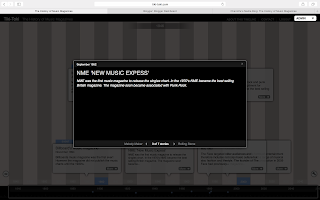
The History of Music Magazines


Unfortunately the link to this interactive timeline is unavailable. 

Here are screenshots of an interactive timeline that I created on the History of Music Magazines.

The URL is as following:


About Me

This blog will consist of my Alevel media pieces.